Wells Fargo
Managing digital activity across accounts and cards
10 months. 2 rounds of testing. 10 million users

Role
Design lead
Objective
Mobile first.
Re-imagine the current product, allowing for future scalability of new features and functionality.
Provide an updated visual design that aligns with rebrand.
Explore concepts beyond initial launch.
Process
Discovery
Design
Testing
Iteration
Delivery
In the beginning, there were Concept Models
After a competative and comparative analysis, we quickly began modeling different approaches to how users might interact with the application’s hi-level objects.We distilled each concept model into possible hi-level frameworks to serve as the navigational hub.


Sketches
While in the office, we used the glass and whiteboards to hash out initial ideas for extending these frameworks to a few key task flows. Ideas can come at anytime. While away from the whiteboard or computer, I sketched using paper.io and my iPad.


Wireframes
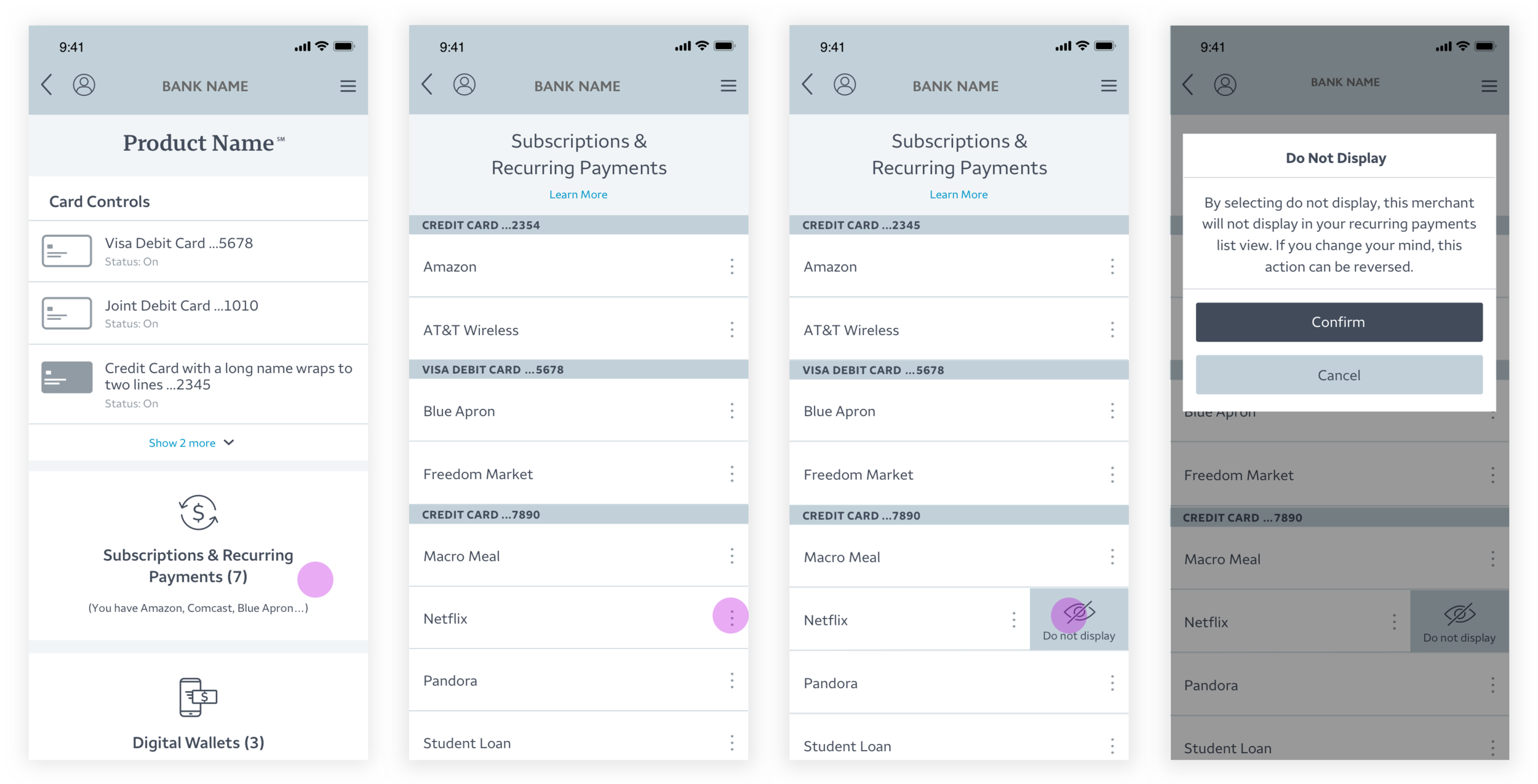
We broke up the client’s feature set into two distinct lists that would represent near and long-term product roadmaps. Next, we began wire framing the near-term vision which would eventually become their pilot launch. We had a number of challenges, one of which was around generating copy that was not only clear and explanatory, but also compliant with the WF legal team.
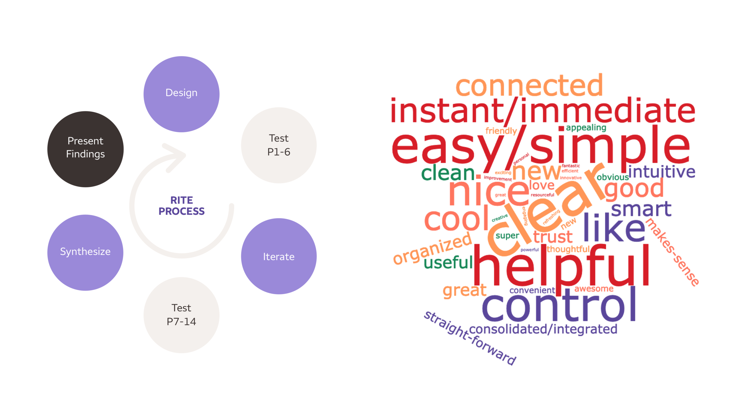
User Testing
We completed 2 rounds of user testing, 1 after low-fidelity wireframes and 1 after producing high-fidelity visual designs. We used the R.I.T.E method which allowed us to iterate and gain valuable insights faster. Much of our iteration focused on terminology since many of the concepts in the product are not universally understood ie; digital wallets, financial applications etc. The image to the right/bottom is a word cloud representing users description of the product at the end of the test.


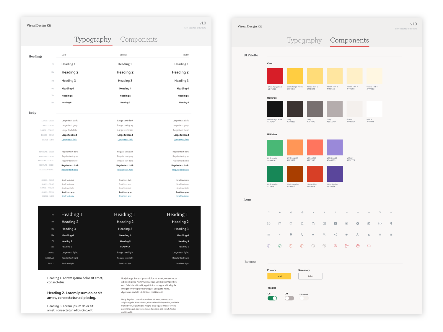
Design System
We created and maintained a global system of components, colors, and typography to guide our visual design process, in sketch. At the end of the project, we included this in our final deliverable.